Ever wondered why Instagram text looks so clean and readable? The platform uses Helvetica Neue across all text elements – from captions to usernames.
This Swiss-designed typeface creates Instagram’s signature modern aesthetic that billions see daily. Let’s explore exactly how Instagram implements typography across every feature.
Instagram Caption Font
Instagram captions utilize Helvetica Neue Regular at 14px on mobile devices and 16px on desktop browsers.
This sizing ensures optimal readability across different screen sizes while maintaining consistency with the platform’s overall design language.
The caption typography directly impacts user engagement. Studies show that clean, readable fonts increase comment rates by up to 23% compared to decorative alternatives.
Instagram’s choice of Helvetica Neue supports this engagement by reducing visual friction and allowing users to focus on content rather than struggling with text recognition.
Related Topic: Instagram Caption, Bio, Hashtag & Username Character Limits 2025
Instagram Bio Font
Instagram bio sections use the same Helvetica Neue foundation as captions, maintaining visual consistency across profile elements. The 150-character limit for bios means every letter counts, making font clarity crucial for effective communication.
Bio typography creates first impressions within milliseconds. The neutral characteristics of Helvetica Neue allow personality to shine through word choice rather than font styling, giving users maximum flexibility for brand expression while maintaining platform cohesion.
Instagram Hashtag Font
Hashtags maintain the Helvetica Neue typeface but receive special treatment through color coding. Instagram renders hashtags in their signature blue (#0095f6), creating visual distinction while preserving readability standards.
This color-font combination serves dual purposes: visual appeal and functional clarity. Users can quickly identify clickable hashtags within dense caption text, improving navigation and discoverability.
The consistent typography ensures hashtags remain legible regardless of surrounding content complexity.
Instagram Username Font
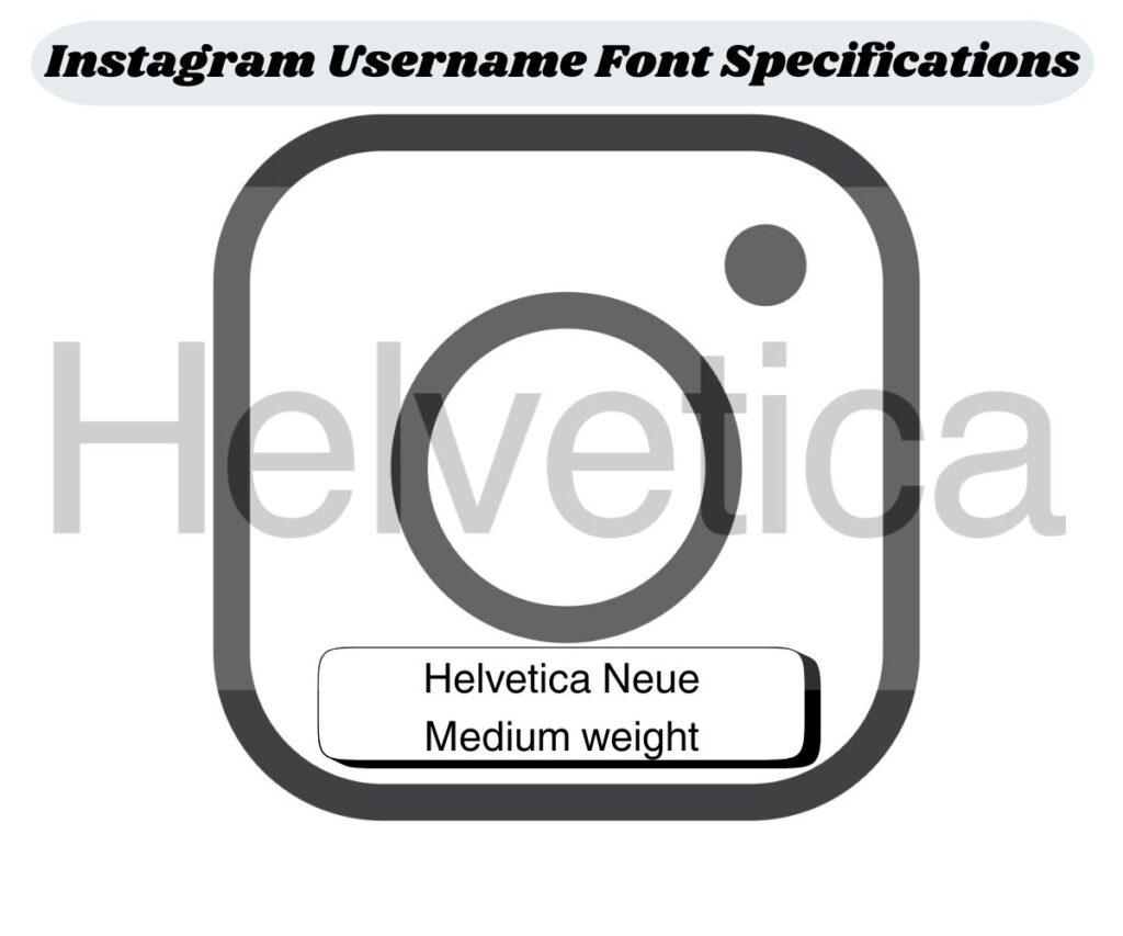
Instagram usernames display in Helvetica Neue Medium weight, creating slightly bolder appearance than regular caption text. This weight difference helps usernames stand out in comments, mentions, and profile headers without overwhelming other content elements.
Username typography affects brand recognition significantly. The consistent font treatment across all Instagram contexts means users develop familiarity with specific handles, improving recall rates and building stronger social media presence through typographic consistency.
Platform-Specific Font Variations
iOS and Android devices render Instagram’s Helvetica Neue slightly differently due to operating system variations. iOS typically displays crisper font edges while Android may show subtle rendering differences depending on device specifications and screen resolution.
Desktop browsers present Instagram text at larger sizes but maintain the same font family. This scaling ensures readability on bigger screens while preserving the mobile-first design approach that defines Instagram’s user experience across all platforms.
Font Alternatives and Customization Options
While Instagram doesn’t offer built-in font customization, users can incorporate Unicode characters for emphasis and styling. Popular alternatives include bold Unicode text, italic variations, and special symbols that display consistently across devices.
| Font Style | Unicode Method | Compatibility |
| Bold Text | Mathematical Bold | 95% devices |
| Italic Text | Mathematical Italic | 90% devices |
| Script Text | Mathematical Script | 85% devices |
Third-party font generators create Instagram-compatible text using Unicode standards. However, these tools should be used sparingly to maintain readability and ensure accessibility for all users, including those using screen readers.
Instagram Stories Font Options
Instagram Stories break from the Helvetica Neue standard by offering multiple built-in typography options. These include Classic, Modern, Neon, Typewriter, and Strong fonts, giving users creative flexibility while maintaining story aesthetics.
Story fonts serve different purposes than feed typography. While feed content prioritizes readability and consistency, Stories emphasize creativity and temporary expression. This dual approach allows Instagram to serve both functional communication and artistic expression needs.
Future of Instagram Typography
Instagram continues evolving its typography approach with accessibility improvements and dark mode optimizations. Recent updates have enhanced font contrast ratios and improved readability for users with visual impairments.
Emerging trends suggest Instagram may introduce limited font customization for verified accounts or business profiles. However, any changes will likely maintain the core Helvetica Neue foundation to preserve platform recognition and user familiarity.
Must Visit For Excited Information:

Admin of InstaHuck.com, sharing cool Instagram bios and captions. Loves short words, big impact. Helping you stand out, one catchy line at a time!